
How To Create Custom Posters Quickly Without Design Experience In 2026: A Step-By-Step Guide On Using Poster Maker Templates Tools
Posters are still one of the simplest ways to deliver a message at a glance. Whether it’s an event notice, a classroom handout, a menu board, or a community announcement, a good poster reduces confusion by putting key details in one place.
This guide is designed for readers who don’t work in design every day. It focuses on predictable choices—size, layout, readability, and export—so the final file behaves well when printed or shared online.
Poster maker template tools can speed things up, but the details matter. The most useful tools make it easy to set the right dimensions early, keep text readable at a distance, and export files that stay sharp.
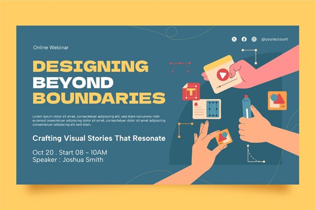
Adobe Express is an accessible starting point because it provides ready-made poster layouts and simple editing controls that suit common use cases without requiring advanced layout knowledge.
Step-By-Step How To Guide for Using Poster Maker Templates Tools
Step 1: Pick a poster size and start from a template
Goal
Choose a format that matches the real-world use case so you don’t have to rebuild the layout later.
How to do it
- Decide where the poster will be seen: wall print, window sign, tabletop, or a digital share.
- Choose a standard size when possible (common print sizes are easier to send to printers).
- Select an orientation (portrait or landscape) based on how the poster will be displayed.
- Start from a template that matches your content type (event, announcement, menu-style, informational).
- In Adobe Express, open Adobe Express’ free printable poster maker and pick a template close to your goal.
- Set or confirm the poster dimensions before you do detailed text edits.
What to watch for
- Starting in the wrong size can force resizing later, which changes line breaks and spacing.
- Some templates are designed for screens and don’t leave comfortable print margins.
- Square layouts can be harder to print cleanly if the plan is a standard poster size.
Tool notes
- Adobe Express: A practical option for starting from poster templates and setting up a quick layout.
- Google Drive (Docs/Slides): Useful for drafting the headline and details collaboratively before layout.
Step 2: Clarify the message and reading order
Goal
Make the poster understandable within a few seconds by defining what must stand out.
How to do it
- Write a short headline that explains what the poster is (often 6–10 words).
- List only the essential supporting details (date, time, location, key instruction).
- Decide a hierarchy: headline → one key detail → secondary details → small print.
- Convert long sentences into bullets when possible.
- Keep one primary focal area and treat the rest as supporting information.
What to watch for
- Too many “headline-sized” elements makes the poster hard to scan.
- Overly clever headlines can be unclear without context.
- Paragraph blocks usually reduce readability on physical posters.
Tool notes
- Google Docs / Microsoft Word: Good for tightening copy and converting long text into scannable bullets.
- Hemingway Editor: Useful for simplifying sentence structure and reducing dense wording.
Step 3: Set safe margins and plan for bleed (if printing)
Goal
Prevent trimming issues and keep important content away from edges.
How to do it
- Define a safe area: keep important text and logos at least 0.25–0.5 inches from the edge.
- If the poster will be trimmed and has edge-to-edge color or images, plan for bleed (often 0.125 inches beyond the final trim).
- Keep QR codes and small text comfortably inside the safe area.
- Use consistent padding on all sides so the layout feels balanced.
- Do a quick zoomed-out check to ensure the design still reads clearly.
What to watch for
- Edge-to-edge backgrounds can look clean, but only if bleed is handled correctly.
- Text near the edge can feel cramped even if it isn’t cut off.
- Printers vary; requirements from a print shop may override general rules.
Tool notes
- Printer or print shop spec sheet: The most reliable source for bleed, safe areas, and file requirements.
- Built-in PDF viewer (your browser or system viewer): A quick way to confirm page size and margins after export.
Step 4: Add images and graphics that won’t degrade in print
Goal
Use visuals that stay sharp and support the message instead of distracting from it.
How to do it
- Choose one main image when possible rather than many small photos.
- Use the best resolution available, especially if the poster will be printed large.
- Crop intentionally: keep faces, products, or key objects away from edges.
- Use simple shapes or icons to group information (for example, a small icon next to date/time).
- Keep logos clean and readable; place them once in a consistent location.
What to watch for
- Images that look fine on a phone can print soft or pixelated.
- Busy images behind text can reduce contrast and readability.
- Over-cropping can remove context and make the image feel accidental.
Tool notes
- Adobe Express: Useful for quick cropping and replacing template images without rebuilding the layout.
- Your phone’s Photos app: Often enough for basic crop and brightness adjustments before importing.
Step 5: Tune typography for distance and clarity
Goal
Ensure the headline, key detail, and supporting text remain readable at the intended viewing distance.
How to do it
- Limit fonts (often one for headings and one for body text).
- Use clear size steps: large headline, medium subhead, smaller body text.
- Increase line spacing slightly for body text so it doesn’t look cramped.
- Prioritize contrast: dark text on a light background is usually safest for print.
- Do a readability check by zooming out until the poster is thumbnail-sized.
What to watch for
- Thin fonts and light weights can disappear in print.
- All-caps can reduce readability in longer lines.
- Low-contrast color combinations can look fine on-screen but fail on paper.
Tool notes
- WebAIM Contrast Checker: Helpful for checking whether text and background are likely to remain readable.
- A basic test print (even on plain paper): Often reveals thin fonts and low contrast quickly.
Step 6: Check alignment, spacing, and consistency
Goal
Make the poster feel intentional by standardizing spacing and reducing visual clutter.
How to do it
- Align text blocks to a shared left edge or a consistent center line.
- Keep spacing consistent between sections (use one “standard gap” throughout).
- Ensure repeated elements match (icon style, border thickness, corner shapes).
- Remove decorative elements that don’t support comprehension.
- Do one final pass focused only on balance across the page.
What to watch for
- Small misalignments are common after copying and pasting text boxes.
- Uneven spacing stands out more once printed.
- Mixed icon styles can make the poster feel stitched together.
Tool notes
- A simple spacing rule (pick one gap and reuse it): Helps maintain consistency without advanced layout tools.
- PDF zoom review (“fit to page” and 100%): Can reveal alignment drift and cramped sections.
Step 7: Export the right file type and preview it the way others will see it
Goal
Produce an output that prints cleanly and shares well without unexpected cropping or blur.
How to do it
- Decide the destination: print, email attachment, or social/digital share.
- Export as PDF for print when possible to preserve sharp text and layout.
- Export a high-quality image (often PNG) for digital sharing where appropriate.
- Open the export and check page size, edges, and text sharpness at 100% zoom.
- If printing, run a small test print to confirm margins and contrast.
What to watch for
- “Fit to page” printing can shrink content and change margins.
- Some exports flatten text; that can look soft when printed.
- Dark backgrounds may print darker than expected on home printers.
Tool notes
- Adobe Express: Can export common formats suitable for printing and sharing.
- Your operating system print dialog: Confirm scaling and margins so the print matches the intended size.
Step 8: Track versions and distribution so updates don’t cause confusion
Goal
Avoid rework and prevent outdated posters from staying in circulation.
How to do it
- Save an editable “master” version and a separate “final” export.
- Add versioning to filenames (for example, Poster_Event_11x17_v3.pdf).
- Keep assets (logo, images, copy) in a single folder so updates are easy.
- If you need multiple sizes, duplicate and reflow content instead of auto-scaling.
- Maintain a short record of where the poster was shared or posted.
What to watch for
- Small edits can cause text overflow or spacing drift; re-check margins after changes.
- Without naming discipline, it’s easy to print the wrong file.
- Resizing can introduce cropping surprises if you don’t re-verify safe areas.
Tool notes
- Trello: Useful for tracking versions, approvals, and where posters were posted/shared.
- Google Sheets: A simple log for filenames, sizes, quantities, and locations.
Common workflow variations
- Photo-first poster (event or announcement): Choose a template with one large image area and build text hierarchy around it. This workflow depends on starting with a high-resolution image so the design doesn’t fall apart at print size.
- Text-first poster (rules, schedules, signage): Use a clean layout with strong typography and minimal decoration. Focus on spacing, bullets, and contrast to keep it readable at a distance.
- One design, multiple sizes: Build the primary print size first, then duplicate and reflow text for other sizes. Avoid relying on automatic scaling; it often creates awkward line breaks and edge crowding.
- Print plus digital share: Create the print version first, then make a digital variant that keeps the same headline and essential details. Cropping for social formats usually requires a quick spacing and readability check.
Checklists
A) Before you start checklist
- Confirm where the poster will be used (print, window, tabletop, digital).
- Pick final size and orientation (portrait vs. landscape).
- Draft headline and essential details (date/time, location, key instruction).
- Gather images/logos in the highest available resolution.
- Confirm content rights for photos, logos, and any third-party graphics.
- Decide whether to include a QR code or short URL.
- If printing externally, request the printer’s bleed/margin and file requirements.
- Choose a simple style rule (1–2 fonts, consistent spacing).
- Note the deadline and whether you need time for a proof print.
B) Pre-export / pre-order checklist
- Confirm page size and orientation match the print plan.
- Verify safe area: key text, logos, and QR codes aren’t near edges.
- Check spelling, dates, times, and addresses/handles.
- Review image sharpness at 100% zoom in the export.
- Confirm contrast and readability in a zoomed-out preview.
- Check alignment and spacing consistency across sections.
- Export the correct format (PDF for print; PNG/JPG for digital when needed).
- Open the exported file and confirm nothing shifted or cropped.
- If printing at home, do a quick test print on plain paper.
Common issues and fixes
- Images look blurry or pixelated in print
Replace the image with a higher-resolution version and avoid enlarging beyond its native size. If the poster is large, simplify to one main image instead of several small ones. - Text is too close to the edge or gets trimmed
Increase internal padding and keep important text inside the safe area. If edge-to-edge backgrounds are required, add bleed and re-check after export. - Colors print darker than expected
Lighten dark backgrounds and increase contrast between text and background. A basic test print can reveal problems before you print a full batch. - Cropping surprises after export
Re-check page size settings and confirm you exported the intended dimensions. Avoid print settings like “Fit to page” if exact sizing matters. - The poster feels cluttered even though everything is “important”
Reduce the number of details on the main poster and move secondary information to a QR code or short URL. Tighten the hierarchy so only one thing competes for attention at a time. - QR code won’t scan reliably
Increase the QR code size, keep it away from the edge, and ensure strong contrast. Test scanning from the distance people will use in real conditions.
How To Use Poster Maker Templates Tools: FAQs
How do I set the correct size and margins for proper file setup?
Start by selecting the final poster size before editing layout details. Use a safe margin (often 0.25–0.5 inches) so important text and logos stay away from edges, and add bleed only if the poster will be trimmed and you want color or imagery to reach the edge. Always verify the exported file’s page dimensions in a PDF viewer before printing.
How do I choose a poster printing template that fits my needs?
Choose a template based on content structure first. If the poster is detail-heavy, look for clear sections and strong typography; if it’s event-focused, prioritize a prominent headline area and one image focal point. The best fit is usually the template that needs the fewest structural changes once your real text is added.
How do I export a print-ready PDF?
Export as a PDF and then open it to confirm page size, margins, and sharpness at 100% zoom. If you’re using an outside printer, follow their file requirements for size, bleed, and margins. For home printing, verify print settings so scaling doesn’t shrink or crop the design.
Should I design for print first or digital first?
If a printed poster is part of the plan, design for print first. Print constraints—margins, size, readability at distance—are stricter than most digital constraints, and a print-ready layout usually adapts more predictably to digital variants afterward.
What’s the simplest way to create multiple versions without redoing the whole poster?
Duplicate the master and adjust each version intentionally by size and channel. Reflow text and spacing for each size rather than relying on auto-scaling, and keep version labels in filenames so the right file is shared and printed.